Taipei Performing Arts Center Website Renewal
Play Different Together
讓藝術不再有距離
臺北表演藝術中心是一個匯聚創意能量的藝文樞紐、與時俱進的表演藝術基地,核心精神是「Play Different Together」,秉持藝術共樂、人才培育及多元創新的理念,致力將藝術帶入群眾的日常生活,打造一座全民劇場。臺北表演藝術中心積極開創所有的可能,以藝術推廣、在地連結、人才培育、國際連結為方向,不僅要成為藝術呈現的場域,也是藝術家的創意基地,並以成為亞洲共製中心為目標,凝聚臺灣及國際藝術的創意能量。
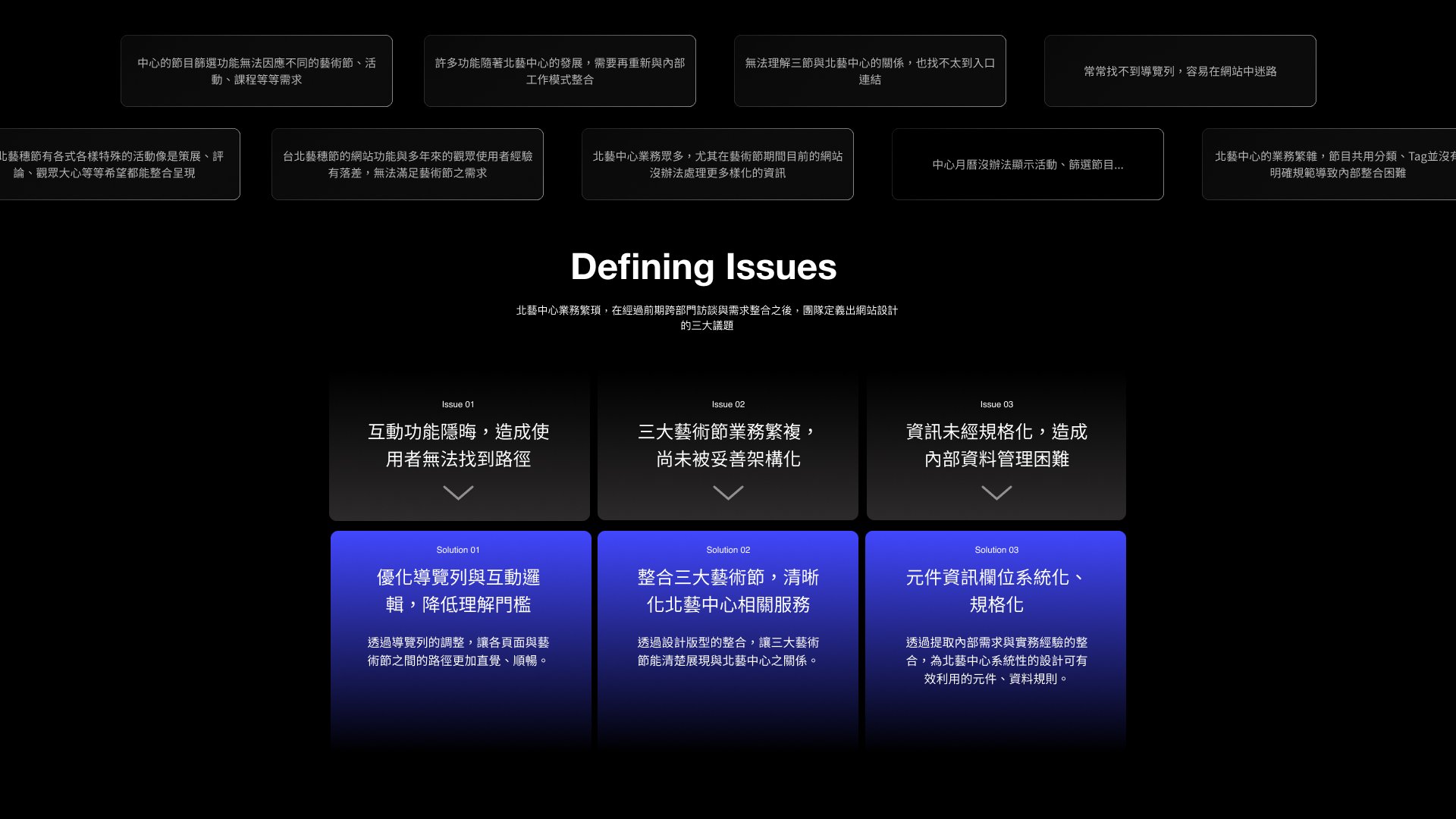
在前一個版本的網站設計中,許多使用者經驗的問題隨著中心的營運與市民的反饋逐漸浮現,本專案透過前期的內外部需求整合,重新為北藝中心打造一個更加適用的網站設計,強化使用者經驗。
The Taipei Performing Arts Center is a vibrant hub of creativity and a progressive base for performing arts. With the core spirit of “Play Different Together,” it upholds the ideals of shared artistic enjoyment, talent cultivation, and diverse innovation. The center is dedicated to integrating art into everyday life, creating a theater for all. It actively explores all possibilities with a focus on art promotion, local connections, talent development, and international linkages. Its goal is to become a co-production center in Asia, gathering creative energy from Taiwan and around the world.
In the previous version of the website design, various user experience issues emerged over time with the center’s operations and citizen feedback. This project aims to create a more suitable website design for the Taipei Performing Arts Center by integrating internal and external needs in the early stages, enhancing user experience.
Open & Friendly 優化導覽列與互動邏輯,降低理解門檻
設計以透過導覽列的調整,讓各頁面與藝術節之間的路徑更加直覺、順暢。在保有品牌調性之下,調整網站易用性,並整合內部業務經驗、外部民眾需求,創造更佳友善的路徑,協助北藝中心傳遞藝術、鏈結產業。
Flexible & Clear 元件資訊欄位系統化、規格化
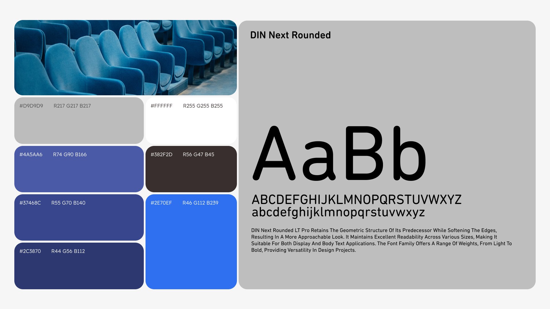
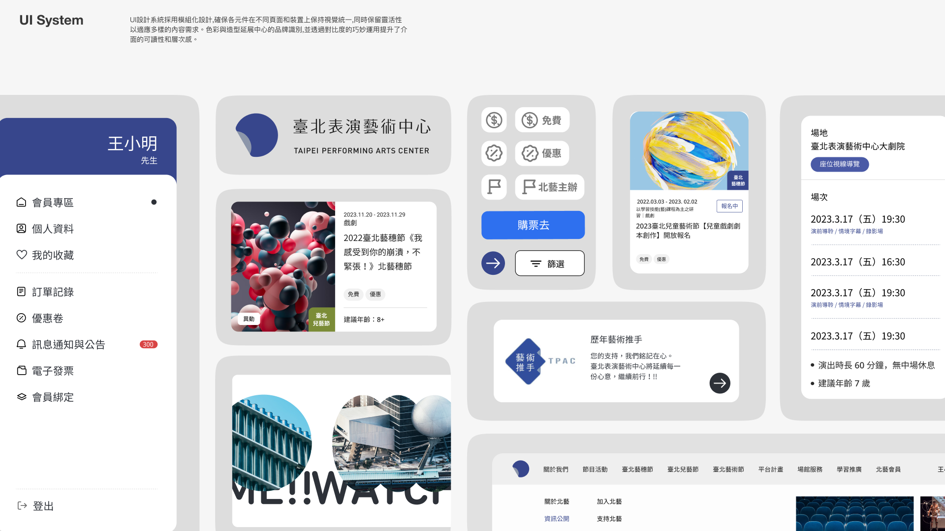
新的設計透過層級與資訊內容的整合,重新定義首頁的敘事與區塊彈性,以解決北藝多元且多變化之業務需求。UI設計系統採用模組化設計,確保各元件在不同頁面和裝置上保持視覺統一,同時保留靈活性以適應多樣的內容需求。色彩與造型延展中心的品牌識別,並透過對比度的巧妙運用提升了介面的可讀性和層次感。
Rules for All 整合三大藝術節,清晰化北藝中心相關服務
北藝中心的業務之一為藝術節,在設計上須考量藝術節的各自獨立性但又須保持與北藝中心的連結,故在版型上以相同版型不同色系的方式,除了降低團隊維護成本之外,更能為用戶帶來更直覺的使用經驗。
OPEN & Friendly: Optimizing Navigation and Interaction Logic to Lower Understanding Thresholds
The design involves adjusting the navigation bar to make paths between pages and festivals more intuitive and smooth. While maintaining the brand’s tone, the usability of the website is enhanced by integrating internal business experiences and external public needs, creating more user-friendly paths to help the center convey art and link industries.
Flexible & Clear: Systematizing and Standardizing Component Information Fields
The new design redefines the homepage’s narrative and block flexibility by integrating hierarchy and informational content to meet the diverse and changing needs of the center. The UI design system uses a modular approach to ensure visual consistency of components across different pages and devices while retaining flexibility to accommodate diverse content needs. The colors and shapes extend the center’s brand identity, enhancing readability and layering through clever use of contrast.
Rules for All: Integrating Three Major Art Festivals, Clarifying the Center’s Related Services
One of the center’s operations involves art festivals, which need to be independently recognized yet connected to the center. The design uses the same layout with different color schemes for each festival, reducing maintenance costs for the team while providing users with a more intuitive experience.


Click the link to view the website


