HATSUMI 初美
Brand Design
HATSUMI 初美 - 回歸食材的本質
Returning to the Essence of Ingredients
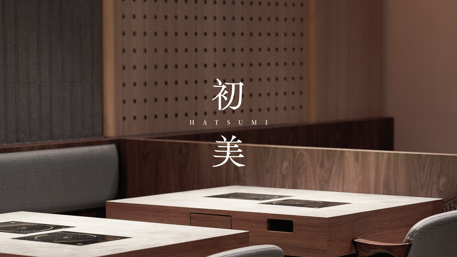
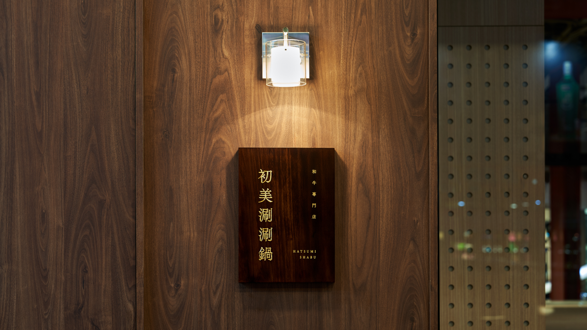
初美是一間位於台中的高級火鍋店,以嚴選食材與純淨湯頭打造精緻火鍋饗宴,為了更完整傳達品牌理念與價值。品牌設計以「回歸美的本質」為核心理念,透過極簡優雅的設計語彙,展現品牌對於純粹、本質的追求。將日式美學中的質樸與靜謐注入每個設計細節,回應品牌專注於食材本質、呈現最純粹美味的精神。整體設計以簡約俐落的線條與留白構築視覺層次,形塑靜雅的用餐氛圍,讓賓客能夠專注感受食材原味,體驗返璞歸真的餐飲美學。
HATSUMI is a hot pot restaurant located in Taichung, offering an exquisite hot pot dining experience with carefully selected ingredients and pure broth to fully convey the brand's philosophy and values. The brand design embodies the core concept of "returning to the essence of beauty," expressing the brand's pursuit of purity and authenticity through minimal and elegant design language. Japanese aesthetics of simplicity and tranquility are incorporated into every design detail, reflecting the brand's focus on the essence of ingredients and presentation of pure flavors. The overall design constructs visual layers through clean lines and negative space, creating a serene dining atmosphere that allows guests to focus on the natural flavors of ingredients and experience the dining aesthetics of returning to simplicity.


標誌設計
以空明朝體打造專注與沈穩
以空明朝體作為標誌,透過字體本身優雅的線條變化與簡約俐落的排版方式,展現出專注且沉穩的品牌調性。襯線體的細節處理呼應品牌對於細節的堅持,同時也展現出成熟穩重的形象。
Logo Design
Crafting Focus and Composure
with Ku Mincho
Using Ku Mincho as the logo typeface, the elegant line variations and clean, refined typography convey a focused and composed brand identity. The serif details reflect the brand’s commitment to precision while also presenting a mature and sophisticated image.
色彩計畫
大地色調呼應樸質品牌價值
以空明朝體作為標誌,透過字體本身優雅的線條變化與簡約俐落的排版方式,展現出專注且沉穩的品牌調性。襯線體的細節處理呼應品牌對於細節的堅持,同時也展現出成熟穩重的形象。
Color Plan
Earthy tones reflect the brand’s
humble and authentic values.
The color scheme centers around warm and understated earth tones, incorporating the hues of natural materials such as stone, raw wood, and ceramics to create a simple yet elegant visual foundation. Through these modest color combinations, a serene and layered spatial atmosphere is created, bringing the overall design closer to the brand's essential philosophy.
輔助圖型
抽象化構築石鍋與食材
輔助圖形設計靈感來自於用餐情境中的各種元素,包含精緻的陶瓷碗盤、講究的餐具、嚴選的食材等,將這些元素抽象化後重新構築,呈現出優雅細膩的視覺語彙。透過這些圖形的運用,不僅豐富了整體視覺表現,更能讓人感受到初美對於餐飲體驗的用心。
Auxiliary Graphics
Abstractly constructing stone pots and ingredients.
The supplementary graphic design draws inspiration from various dining elements, including refined ceramic dinnerware, carefully selected utensils, and premium ingredients. These elements are abstracted and reconstructed to present an elegant and delicate visual vocabulary. The application of these graphics not only enriches the overall visual presentation but also conveys HATSUMI 's dedication to the dining experience.
HATSUMI Brand Design
初美品牌設計
Art Direction | Yi-Hsuan Li
Visual Design | Yi-Hsuan Li, Tako Chang
Menu Design | Tako Chang
Menu Photography | Shengyuan Hsu
Client | HATSUMI


