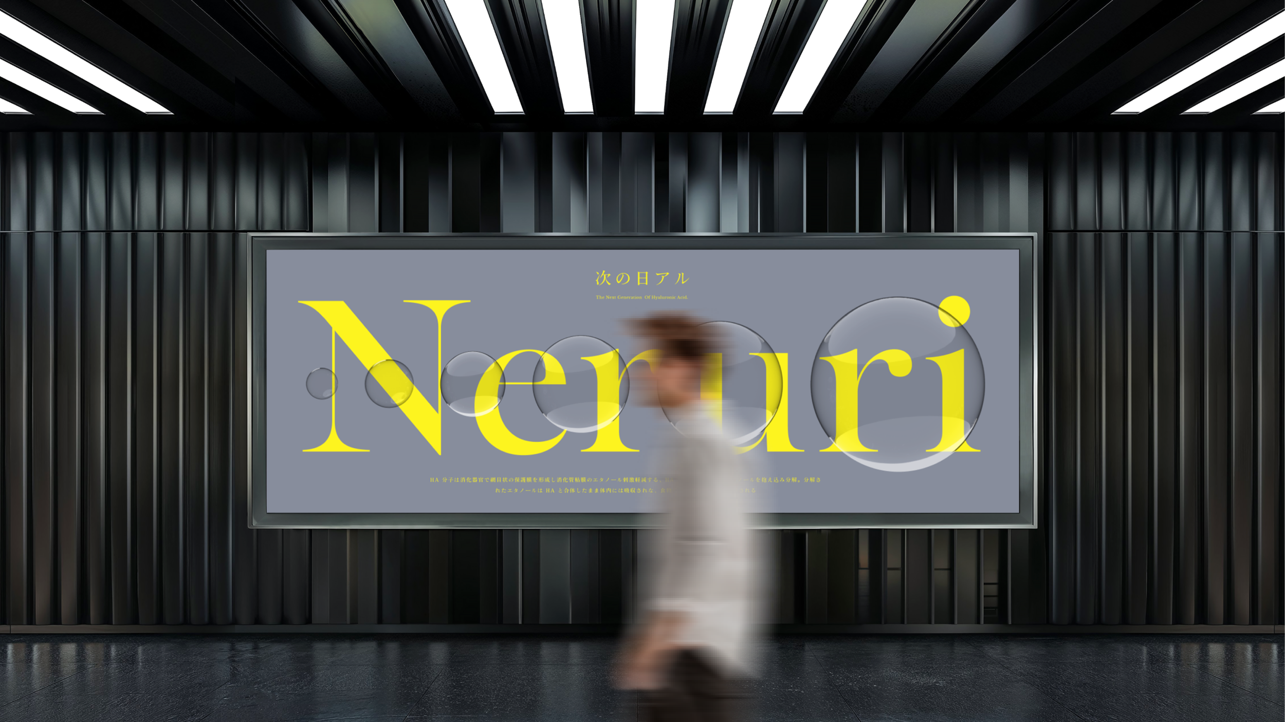
Neruri Brand Identity & Experience
為明日創造更加耀眼的自信
Brighter Tomorrow
Neruri 成立於日本,主力於玻尿酸相關產品開發。品牌識別奠基於團隊重點技術「全分子玻尿酸」,將大中小分子整合於標誌與輔助圖型中,延展出清澈、水珠之造型,呼應品牌技術與產品中保濕含水的特性,讓消費者更加無門檻的瞭解其技術優勢與特色,進一步吸引注重科技和自我護理的現代女性消費者。StudioPros 透過前期的研究與訪查解析日本市場,藉由視覺之定調為品牌打造品牌打造凸顯「玻尿酸」之多元應用技術之識別形象。
Neruri, founded in Japan, specializes in the development of hyaluronic acid-based products. The brand identity is built on the core technology of "full-molecule hyaluronic acid," integrating large, medium, and small molecules into the logo and auxiliary graphics. The design features clear, water droplet-like forms, reflecting the moisture-retention properties of the technology and products. This approach helps consumers easily grasp the brand's technical advantages, appealing to modern women who prioritize technology and self-care. StudioPros conducted thorough market research in Japan, using the insights to shape a visual identity that highlights the diverse applications of hyaluronic acid technology.
將產品特色「全分子」視覺化
品牌識別奠基於團隊重點技術「全分子玻尿酸」,將大中小分子整合於標誌與輔助圖型中,延展出清澈、水珠之造型,呼應品牌技術與產品中保濕含水的特性,讓消費者更加無門檻的瞭解其技術優勢與特色,進一步吸引注重科技和自我護理的現代女性消費者。
Visualizing the product feature "full-molecule" integration.
The brand identity is founded on the core technology of "full-molecule hyaluronic acid," integrating large, medium, and small molecules into the logo and supporting graphics. These elements are extended into clear, water-droplet shapes that reflect the brand's hydration and moisture-retention qualities. This design approach makes the technology and its benefits easily understandable, further attracting modern female consumers who prioritize both innovation and self-care.
讓品牌發光的色彩系統
視覺溝通透過明亮的黃色展現閃耀的輕盈感,並以中性的灰銀色保有科研的專業性,調配屬於Neruri的獨特性格。此外,根據品牌的產品支線,建構不同的色彩系統以因應產品的溝通調性。
A color system that makes the brand shine.
Visual communication is expressed through a bright yellow, evoking a sense of radiant lightness, while a neutral silver-gray maintains the scientific professionalism, shaping the unique personality of Neruri. Additionally, different color systems are developed for each product line to align with their distinct communication tones.
呼應品牌成效與特點的輔助圖型
輔助圖形以剔透純淨的水珠,建構出穩定水潤的意象,將玻尿酸的特性透過不同的水滴不斷地向消費者傳遞滋潤通透感。此外,也透過暈光、發光的視覺畫面呼應產品使用後的感受。此外,整體排版以清晰、乾淨的影像輔以重點式、數據化內容,將艱澀的科研成分轉化為易讀、清楚的排版,節省資訊理解路徑強化傳播力。
Brand graphics that reflect the brand's effectiveness and key features.
The supporting graphics utilize transparent, pure water droplets to create an image of stable hydration, effectively conveying the moisturizing properties of hyaluronic acid through various representations of water. Additionally, soft glows and radiant visuals reflect the sensation of using the product. The overall layout is clear and clean, combining key highlights and data-driven content, transforming complex scientific components into an easy-to-read format, thereby enhancing the clarity and impact of communication.


