
映象品牌重塑
IMAGE AUDIO Brand Design
映象,綻放家的美好想像
Inspired Mastery, Elevating Home Imaginations.
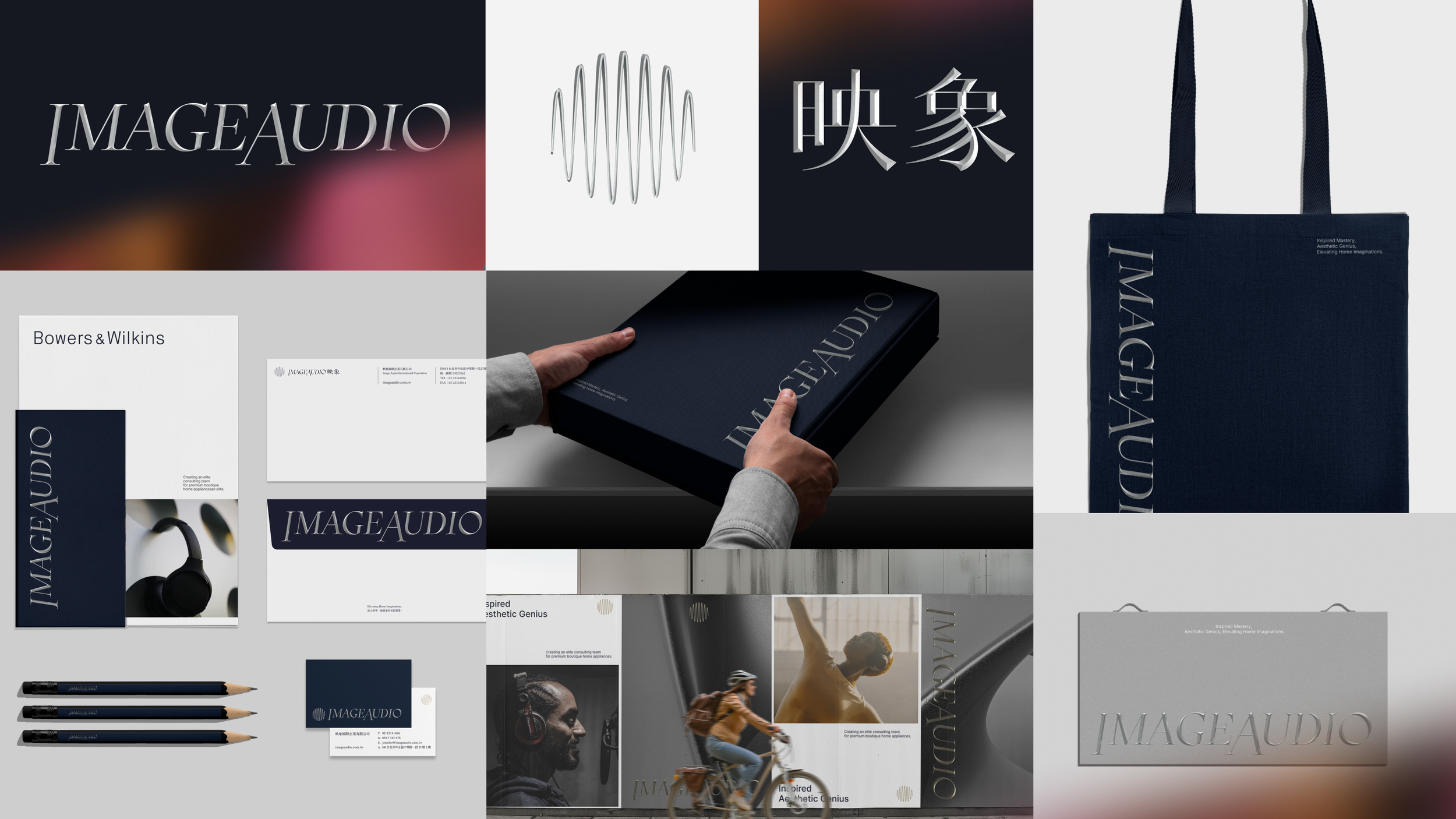
映象音響(IMAGEAUDIO)是一家專注於音響設備的品牌,致力於提供高品質音響系統。在高端音響設備和定製化音響系統的領域擁有顯著的市場佔有率,並代理多個國際頂級音響品牌,包括 B&W 及 Sonus faber。近年公司雖然跨足數位家電市場,卻面臨品牌形象老化及市場辨識度不足的挑戰。
由於品牌設計缺乏統一系統,使其難以在競爭激烈的市場中突顯獨特價值。StudioPros 透過品牌定位與設計重塑,將家電融入美學與精緻化體驗,為現代居家創造嶄新的風格想像。
IMAGEAUDIO is a brand focused on audio equipment, dedicated to providing high-quality sound systems. Having established a significant market share in high-end audio equipment and customized sound systems, the company serves as an authorized dealer for many international premium audio brands, including B&W and Sonus faber. While the company has recently expanded into the digital home appliance market, it faces challenges with an aging brand image and insufficient market recognition. The lack of a unified brand design system makes it difficult to highlight its unique value in a highly competitive market. Through brand positioning and design transformation by StudioPros, IMAGEAUDIO integrates home appliances with aesthetic and refined experiences, creating new stylistic possibilities for modern living spaces.


標誌設計
音波流動,交織家的圓滿
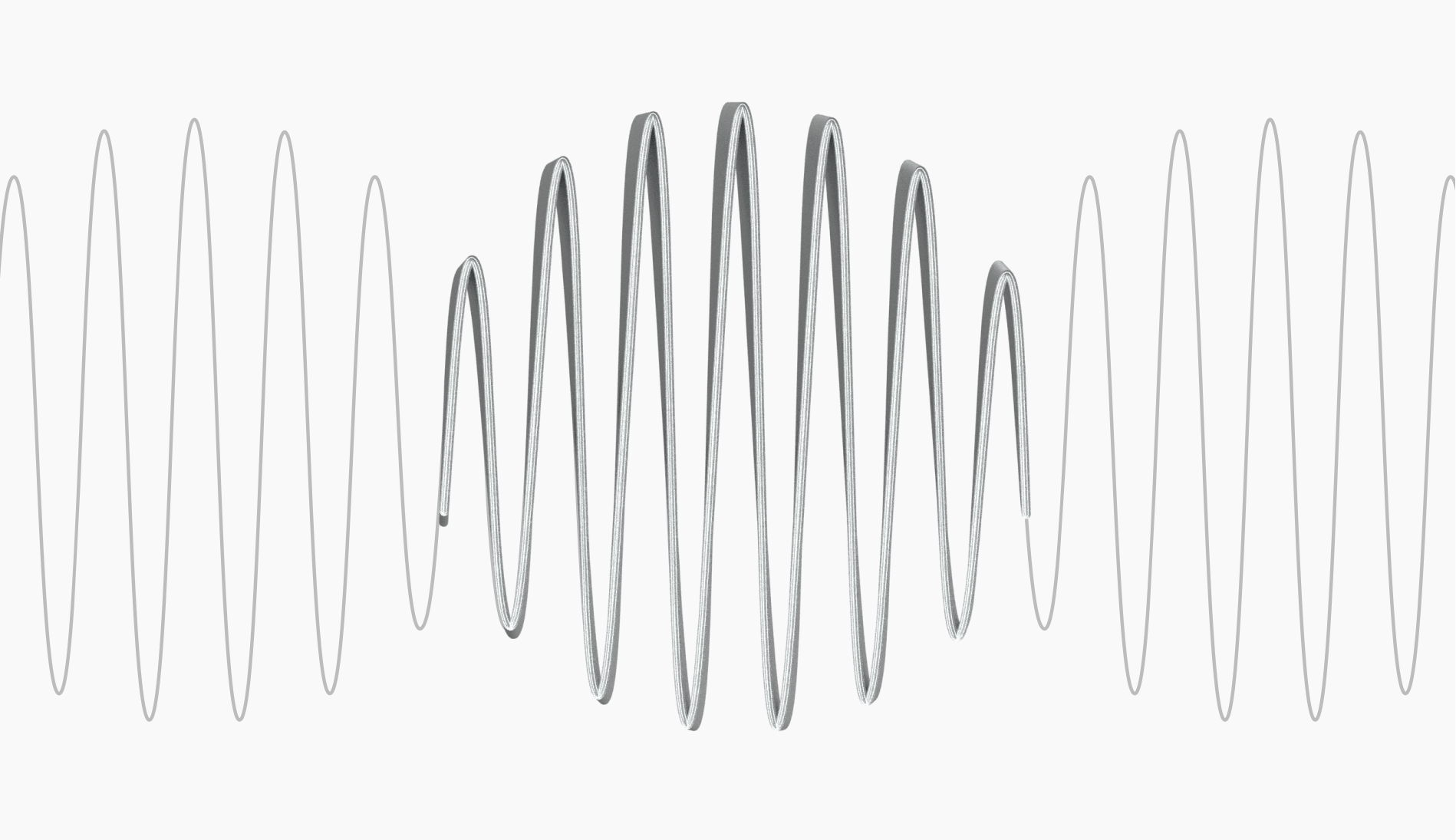
概念源自聲音在空間中優雅震動波形,透過簡潔流暢的線條呈現音波的動感與連續性,以波段象徵映象與消費者之陪伴關係,透過品牌所打造之高端品味的精品家電,交織出家的圓滿。
The concept is inspired by the elegant vibration of sound waves in space. Through clean and fluid lines, it captures the dynamism and continuity of sound waves. The waveforms symbolize the connection between Imageaudio and its consumers, representing a sense of companionship. By crafting high-end, tastefully designed home appliances, the brand weaves together a sense of harmony and completeness in the home.
Logo Design
Sound waves flow, weaving the harmony of home.


標誌以「三獎築山」為核心概念,透過三個長形方體構築山的意象,對應三大獎項,同時融入書法藝術的點、線、面元素,展現層疊的文化傳承意涵。
綻放韻律的標準字
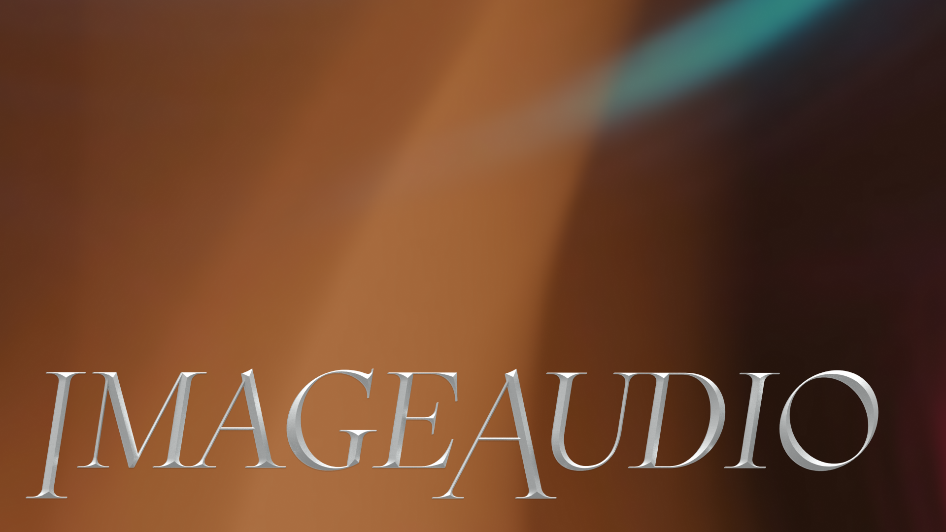
The logotype features an elegant, all-uppercase typeface with refined strokes and distinctive weight contrast, creating a visual tension that balances fashion with sophistication. The enlarged initial letter enhances brand recognition while creating a blooming visual rhythm, improving both readability and memorability.
A logotype that blooms with rhythm.
簡練低調的色彩系統
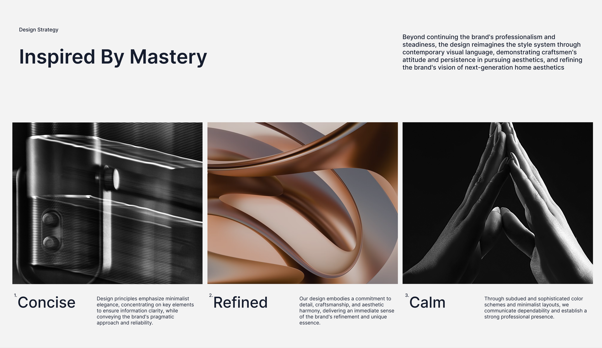
色彩溝通以溫潤的褐色系展現高端精緻感,搭配柔和的米色調營造舒適質感,透過兩者的和諧搭配,平衡專業與親和力。同時以內斂優雅的色彩組合,展現 IMAGEAUDIO 對品味生活的追求。
A refined and understated color system.
The color communication employs warm brown tones to convey premium refinement, paired with soft beige hues that create a sense of comfort. This harmonious combination strikes a perfect balance between professionalism and approachability. The understated yet elegant color palette reflects IMAGEAUDIO's dedication to cultivating a sophisticated lifestyle.
輔助圖形延續聲學概念,以簡約線性的設計表現穩重格調。
Pattern 01 - 韻動
以流暢的聲波線條,展現聲音的流動與環繞效果。波形的起伏象徵家電陪伴的持續性,環繞全方位的生活體驗。
Pattern 02 - 展域
由中心向外放射的幾何線條,展現能量與科技感。放射狀圖形象徵品牌服務的全方位覆蓋與觸及每個角落的服務。規律的幾何線條則展現專業穩重之核心價值。
The supporting graphics extend from acoustic concepts, expressing refined elegance through minimalist, linear designs.
Pattern 01 - Sonic Harmony
Flowing sound wave lines demonstrate the movement and surround effect of audio. The undulating waveforms symbolize the continuous companionship of home appliances, encompassing a comprehensive living experience.
Pattern 02 - Expanding Field
Geometric lines radiating from the center express energy and technological sophistication. The radial pattern symbolizes our comprehensive service coverage, reaching every corner of living spaces. The rhythmic geometric structure conveys our core values of professionalism and stability.
ImageAudio Brand Design
映像品牌重塑
Design Agency | StudioPros Design
Art Director | 李宜軒 Yi-Hsuan Li
Brand Experience Director | 張文馨 Moon Chang
Visual Design | 李宜軒 Yi-Hsuan Li、張宇宏 Tako Chang
Logotype Designer | 鄭原傑 Yuan-Chieh Cheng
Brand Guidelines System | 張宇宏 Tako Chang、鄭原傑 Yuan-Chieh Cheng
Client | IMAGE AUDIO
Year | 2024


